


Color scheme has become a pivotal part of business in various aspects. From branding to packaging, having a consistent color scheme can help your company and products stand out in competitive markets. PMS (Pantone Matching Scheme) colors have revolutionized numerous industries, allowing businesses to replicate and use colors accurately. Understanding and leveraging PMS colors not only bridges the gap between physical objects and digital imagery but also cements brand identity
The Essence of PMS Colors
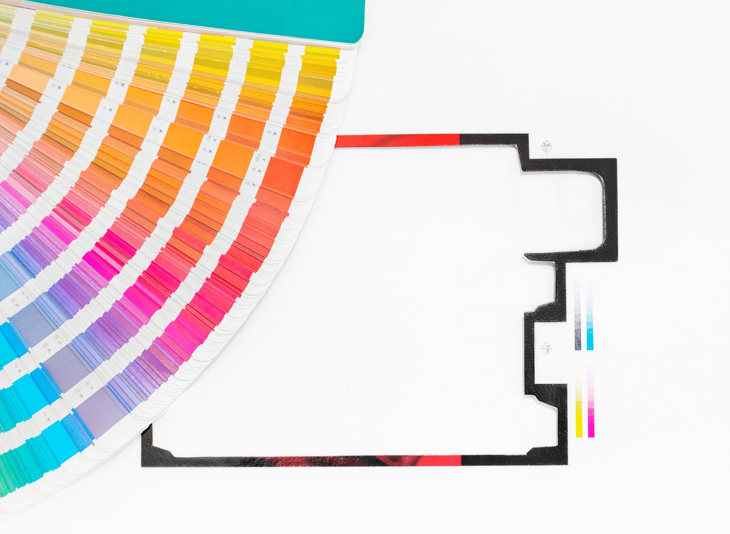
Imagine a world where the color you select is the color you get, no matter the medium. This is the world PMS colors offer. Unlike the more commonly known RGB and CMYK color models, which cater to digital displays and standard printing respectively, Pantone colors stand apart in their ability to offer a universally consistent color language. With a repertoire of over 15,000 colors, each Pantone shade is more than just a color. It’s a specific formula and a unique identifier that ensures the exact hue can be replicated across various media and materials worldwide.
The Crucial Role of Color Consistency
Color consistency is not just a detail; it’s the cornerstone of brand identity and customer trust. The impact of color variation can ripple through the perception of your brand, altering its recognition and trustworthiness. This is where the PMS system shines, offering a beacon of standardized colors that ensure your brand’s hues remain unaltered, whether they appear on a physical product, a digital screen, or print media. It is this consistency that builds a silent, yet powerful, dialogue of trust and recognition with your audience.
Best Practices for Impeccable Color Matching
Use Physical Swatches
The first step in this color-matching quest involves the use of physical PMS swatches. This practice is fundamental because digital displays, by their nature, are not reliable interpreters of color. Altering screen parameters such as contrast and brightness can profoundly affect the perception of colors, leading to a disparity between digital designs and their tangible versions.
On the flip side, actual PMS swatches act as a dependable comparison tool under diverse lighting conditions, specifically the light settings intended for the final product’s display. This technique recognizes the influence of material properties on color visuals, ensuring that design and production teams make informed color decisions. Consequently, this cuts down on the likelihood of needing expensive modifications or turning down projects.
Leverage Digital Tools
While physical swatches are invaluable, digital tools have emerged as essential companions in the color-matching process. Platforms like Pantone Connect epitomize the synergy between digital innovation and traditional color standards. These tools enable designers to convert their digital color selections into precise PMS equivalents, facilitating a seamless transition from digital design to physical or printed materials.
This digital-to-physical alignment is crucial for maintaining color consistency across media, ensuring that brands and products retain their visual identity in every context. By leveraging these solutions, professionals can navigate the vast Pantone color space with accuracy and ease, ensuring their designs remain true to their original vision.
Understand Material Impact
The relationship between color and material is intricate, with light playing a pivotal role. Different materials reflect and absorb light in distinct ways, influencing how colors are perceived. This often neglected aspect can have a profound impact on color presentation. For instance, a color that looks vibrant on a glossy surface may appear muted on a matte finish.
Grasping how different materials affect color appearance is key to selecting the right colors. The importance of this goes beyond mere visual satisfaction to encompass how well the color holds up and its appropriateness for the intended purpose, making sure the final item is both attractive and practical.
Test and Iterate
The real world is the ultimate testing ground for color accuracy. Prototyping and real-world testing are critical steps in validating color choices. This process allows designers and manufacturers to observe how colors behave under different lighting conditions, in various environments, and when applied to the intended materials. Such testing might reveal unexpected results, prompting adjustments to the color selection or the material. Utilizing this progressive strategy provides a buffer against potential difficulties, ensuring the final creation is in harmony with the desired look and meets the hopes of the audience.
Bottom Line
Achieving color uniformity through PMS transcends technical skills; it involves strategic planning. Following these guidelines allows brands and creators to maintain their visual signature with precision and consistency, thereby strengthening their market presence and earning the trust of consumers.

Leave a comment
All comments are moderated before being published.
This site is protected by reCAPTCHA and the Google Privacy Policy and Terms of Service apply.