

So exactly how important is product packaging psychology, and how big of a role does it play? The answer is it’s absolutely vital to attract customers to your products. Knowing that, creative packaging for cannabis can seem daunting, but with a breakdown, we hope you’ll have all the tools you need to create the perfect branded marijuana packaging.
Customer psychology is not something to overlook regarding your cannabis packaging. Customers take only an average of 90 seconds to make their product decision, which all comes down to the psychology of aesthetics. We know getting your incredible products into as many people’s hands as possible is a key goal for any business, and with these psychology tips, you can do just that. We will review the key tenants to consider when considering how to package your product for retail.
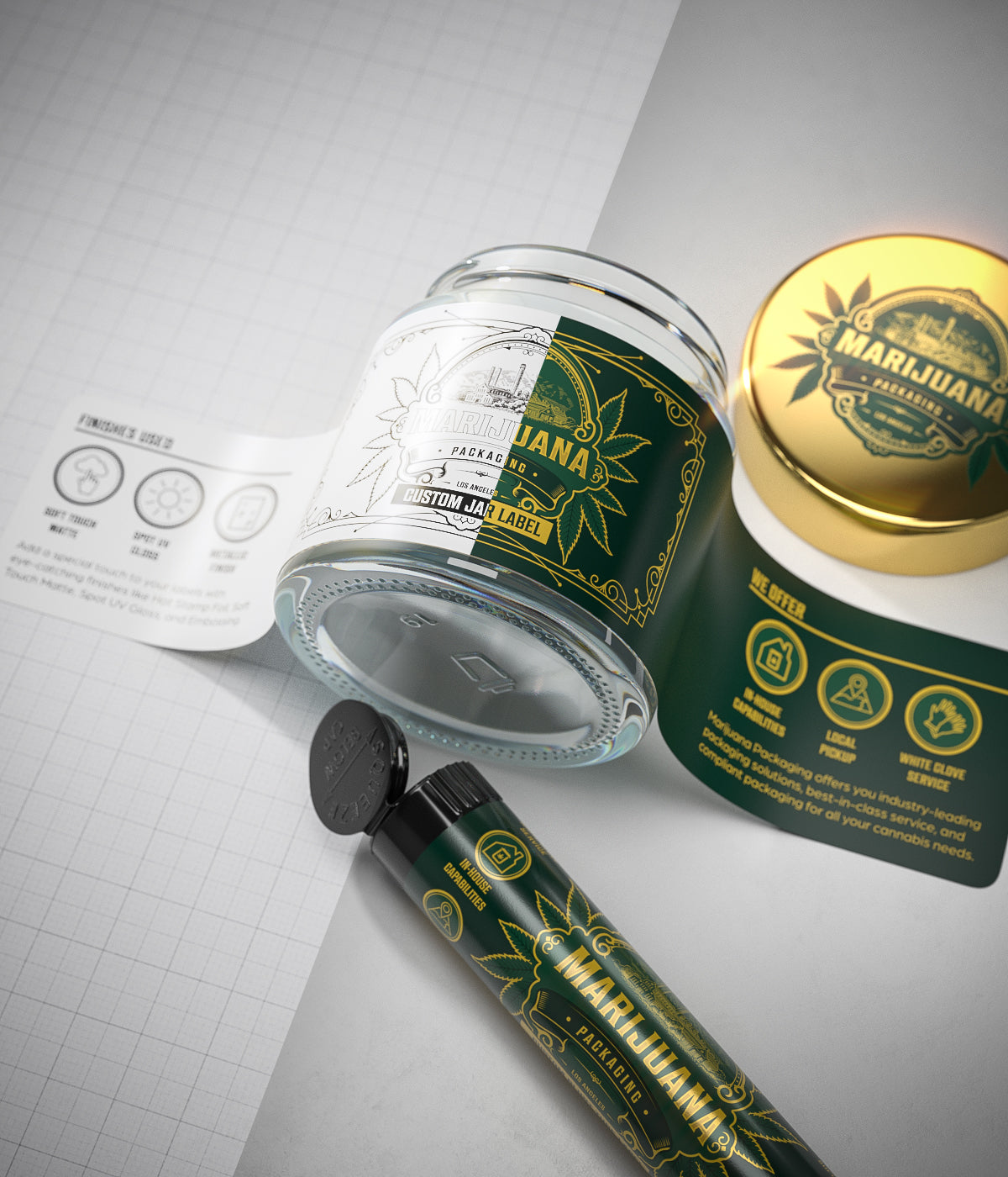
It’s In the Color
So what does color psychology in cannabis packaging have to do with anything? Actually, a lot! Studies have shown that 62-90% of customers base their product assessment on color alone. This quick judgment is because color psychology research has shown that consumers associate colors with moods and emotions; a color that creates a positive attitude will associate that packaging with that mood. Colors have positive and negative associations, and keeping that in mind is vital when creating cannabis packaging.
The knowledge that marketing color psychology can drastically affect sales of your cannabis products means that you can attract customers with the right hue right off the bat. Customers should be able to look at your label color and immediately recognize your brand. For example, take two famous mac and cheese brands: Kraft’s blue and orange vs. Annie’s purple and white. These brands offer very different variations of the same product, and their color schemes are geared toward repeat customers.
So what colorful packaging should your brand use for cannabis packaging? That all depends on the branding message you are trying to convey. Color psychology in cannabis packaging shows us that packaging colors should reflect your logo. Just like Kraft mac and cheese, customers should associate your color palette with your cannabis business.
Let’s break down some associations marketing color psychology creates in consumers:
- Green: health, naturalness, associated with ingestible products
- Yellow: optimism, comfort, warmth
- Red: energy, stamina, power
- Purple: wisdom, creativity
- White: hygienic, serenity, calm
- Black: power, luxury
- Orange: enthusiasm, confidence
- Blue: dependable, classic, strength
Of course, many more colors are out there, but you get the idea. Using color psychology research to pick colors for your weed products has to be informed by the emotions you want customers to feel. If you are selling a strain of stimulating cannabis, using bright and warm colors will convey that (reds, yellows, oranges, pinks, etc.) If you are packaging a mellow, relaxing strain, using cool and deeper colors will better resonate with customers (indigos, blues, purples, greys, etc.)
As long as you are packaging with hues that best represent your brand and product, you are doing it right!
The Rise of Matte
Companies might often overlook the finish of packaging marketing, but it can be just as vital to successful selling your product as color. This has never been more evident than with the rise of matte packaging. While probably only five years ago, stores filled shelves with glossy packaging instead of matte packaging, there are now many more matte packaging options. Undoubtedly, the upward trend in matte aesthetic packaging design is based on consumers’ psychological response to the packaging.
Effective packaging and labels send signals, and matte packaging is no different. It has been tested that matte packaging surfaces are perceived to hold products that are natural, healthy, and sustainable. Matte product packaging in marketing psychology hearkens us to similar surfaces, while glossy surfaces remind us of metals or nonorganic surfaces, matte does the opposite. Organic materials like clay or soil remind us of matte, which is why consumers equate matte with natural.
Just like the impact of color on marketing your cannabis products, matte surfaces have a notable effect. Since we know that matte is often perceived as representative of an ingestible product’s naturalness, matte packaging might be perfect for your cannabis product. The psychology of packaging with matte reflects the naturalness of your cannabis products and, therefore, could be the best choice for drawing in the natural-minded customer. Consumers generally have been upward trending towards natural products, especially marijuana. Customers generally view the cannabis industry as more organic, sustainable, and natural. Since weed is often harvested and sold “off the stem,” customers expect that your company uses natural methods to cultivate and process bud. They will also choose products like cannabutter, CBD lotions, and edibles made with organic ingredients.
We still have love for glossy packaging, though! Glossy packaging can evoke feelings of fun and warmth. Like with any of these psychology tips and tricks, pick what will fit your business best.
To Touch Or Not to Touch
While texture might be overlooked in product packaging design, touch is one of the most vital senses to consider when choosing your cannabis packaging. At the same time, color psychology research illustrates that color often is the initial attractor; texture psychology suggests that touch may be the difference between a customer buying the product or putting it back. Holding onto a packaged product creates a psychological link of ownership, so the texture should encourage consumers to hang on a bit longer. This strengthens that bond between customer and product, furthering their desire to purchase it.
The better the texture, the better the psychological perception of your product. Texture in packaging marketing has also been related to how the product is perceived. If your cannabis packaging is flimsy to the touch, customers, in turn, may believe that your product is not high-quality. If your packaging has tactile, noticeable, and unintentional divots, scratches, or damage, customers will question the integrity of the product it is holding. On the other hand, sturdy packaging that is unblemished to the touch will provide a sense that your product is to be trusted.
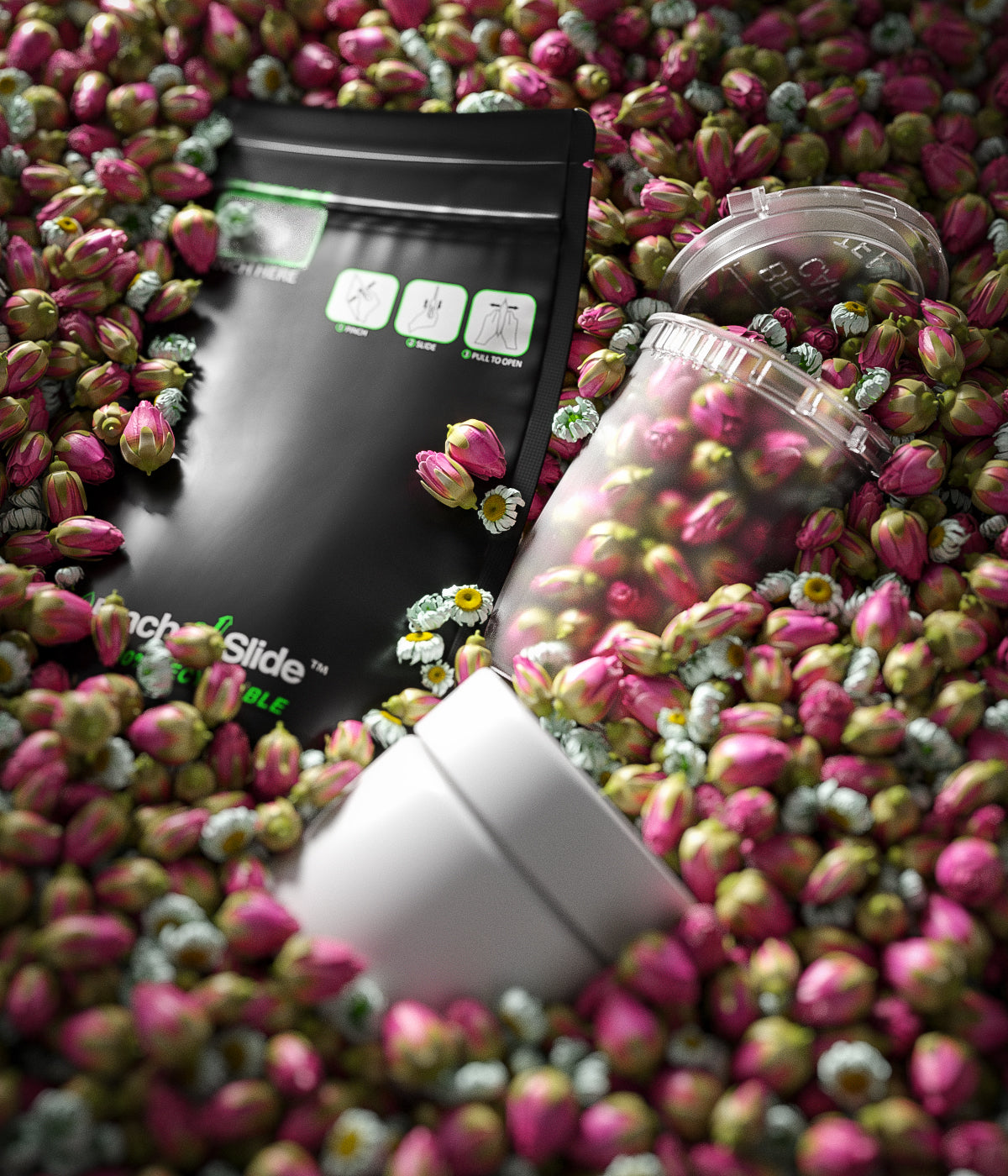
So what textures should your cannabis packaging use to form that psychological link and perception? That will depend on your brand! Do you focus on luxury cannabis products? Package with silky materials like high-gloss branded weed bags. Is your customer base geared towards natural products? Pack weed in earthy textures like recycled paper/cardboard containers. Our friend matte can also provide a natural texture. If your package type is branded jars for weed, ensure the label’s texture reflects your brand.
Marketing with touch psychology is just as crucial as marketing color psychology. Use it to your advantage!
Typography Gets You in Your Feels
Just like we take into account the best eye-catching colors for advertising, we also need to take into account the best typography for cannabis packaging. Fonts are used to communicate what your brand represents, and customers can tie them to psychological emotions that will connect customers with your packaging.
Think of instantly recognizable typography like Disney; the swooping, non-uniform font gives the feeling of whimsy, childlikeness, and creativity. These are all characteristics associated with the Disney brand. Consider Nike’s recognizable font. The slanted, uppercase letters paired with the iconic swoop give the impression of solid letters in movement: perfect for a sports brand. Nike’s typography uses a font that you can access on most word documents: Futura. With a bit of modification, Nike used a standard font to reflect their brand. Font psychologically triggers emotions and associations in us and should be used to your brand’s benefit.
Like texture and color psychology in cannabis packaging, typography should represent your brand. Using sleek and crisp fonts will associate your brand with modernity and luxury. Modifying fonts with cartoon aesthetics like Comic Sans or Chalkboard will connect with customers who look for playful, down-to-earth brands. Cursive fonts psychologically make products feel prestigious and elegant and can be used for cannabis products that are high-quality or more expensive.
Tying typography to the emotions it creates in customers is vital, and making your label/brand font around these feelings will continue to connect your brand to consumers.
Who Doesn’t Love Curves?
What attracts the human eye in terms of shape of packaging is essential to consider when choosing the perfect marijuana packaging. While deciding what packaging marketing shapes work best for your business is up to you, a few studies have backed up psychological tendencies in customers about shape.
One of the most research-backed psychological leanings is that customers find curves more appealing than straight lines. Customers are more likely to associate curved packaging with more open, beautiful, and inviting emotions. Packaging with many pointed and sharp lines/corners is often perceived as threatening and harsh and may turn consumers away from your marijuana products.
This translates to cannabis packaging in several ways. If your business sells pre-rolled joints, use cylindrical customized pre-roll packaging tubes over boxy cuboid packaging. Do you sell branded pre-rolled cones in mylar bags? A smart packaging choice might be to ensure that those bags have rounded corners instead of angular ones.
Another vital successful packaging method for shape is to stand out. In the marijuana business, jars are one of the most beloved ways to store cannabis products. You can experiment with jars that are unique in design; maybe your jars taper towards the button, creating a triangular shape. Perhaps you invest in jars for your edibles shaped like a cannabis leaf. These unique designs will help catch customers’ eyes. But hey, if classic jar packaging (or any classic weed packaging) fits your brand better, always go with that.
Putting All the Pieces Together
No one part of customer packaging psychology trumps the others; they all work together to create a cohesive look that represents your brand. Color, surface, texture, typography, and shape all work together to create the perfect sensory packaging. When designing your cannabis packaging, consider all of these factors for the most psychologically attractive packaging.
Remember, before rolling out packaged products, one of the best rules of thumb is to trust yourself and your team. Look at the finished cannabis packaging and see what feelings it evokes in you. No one knows your brand better than the people who created it, so lean on them. You’ll know when you have the perfect design because you’ll feel the emotions and associations that your customers will feel. When it feels right, your amazing packaged cannabis products are ready to hit the shelves.
Using psychology to elevate and promote your brand will help your marijuana products grow and prosper; there’s no better feeling than that!
Customize Your Products Here!

Leave a comment
All comments are moderated before being published.
This site is protected by reCAPTCHA and the Google Privacy Policy and Terms of Service apply.