


In the realm of retail, the silent yet persuasive language of color wields a remarkable power over consumer choices and brand perception. As companies vie for attention in an overcrowded market, understanding the psychological basis of color preferences in packaging becomes not just an art but a strategic necessity. We’ll delve into the fascinating interrelation of colors and human behavior, shedding light on why different tones in packaging do far more than just please the eye.
The Psychology of Color in Packaging
The essence of packaging design is deeply intertwined with color psychology, an area focused on understanding the emotional and mental responses different colors provoke. This discipline is grounded in the idea that color can influence perception and behavior subtly yet effectively. For instance, the vibrancy of red breathes life into packaging, evoking feelings of passion and excitement, while the serenity of blue builds a foundation of trust and dependability. Through these color choices, brands communicate without words, forging connections with consumers on an emotional level.
How Color Influences Consumer Behavior
It’s astounding to think that nearly 85% of consumer purchasing decisions might be swayed by color alone. This statistic underscores the paramount importance of color in crafting a product’s appeal. The strategic use of red and yellow plays into this dynamic, guiding consumer behavior in crowded retail environments. Beyond mere attraction, the emotional resonance of colors—from the joyousness of yellow to the solemnity of black—emphasizes the critical role that hue selection plays in packaging design.
The Significance of Specific Colors
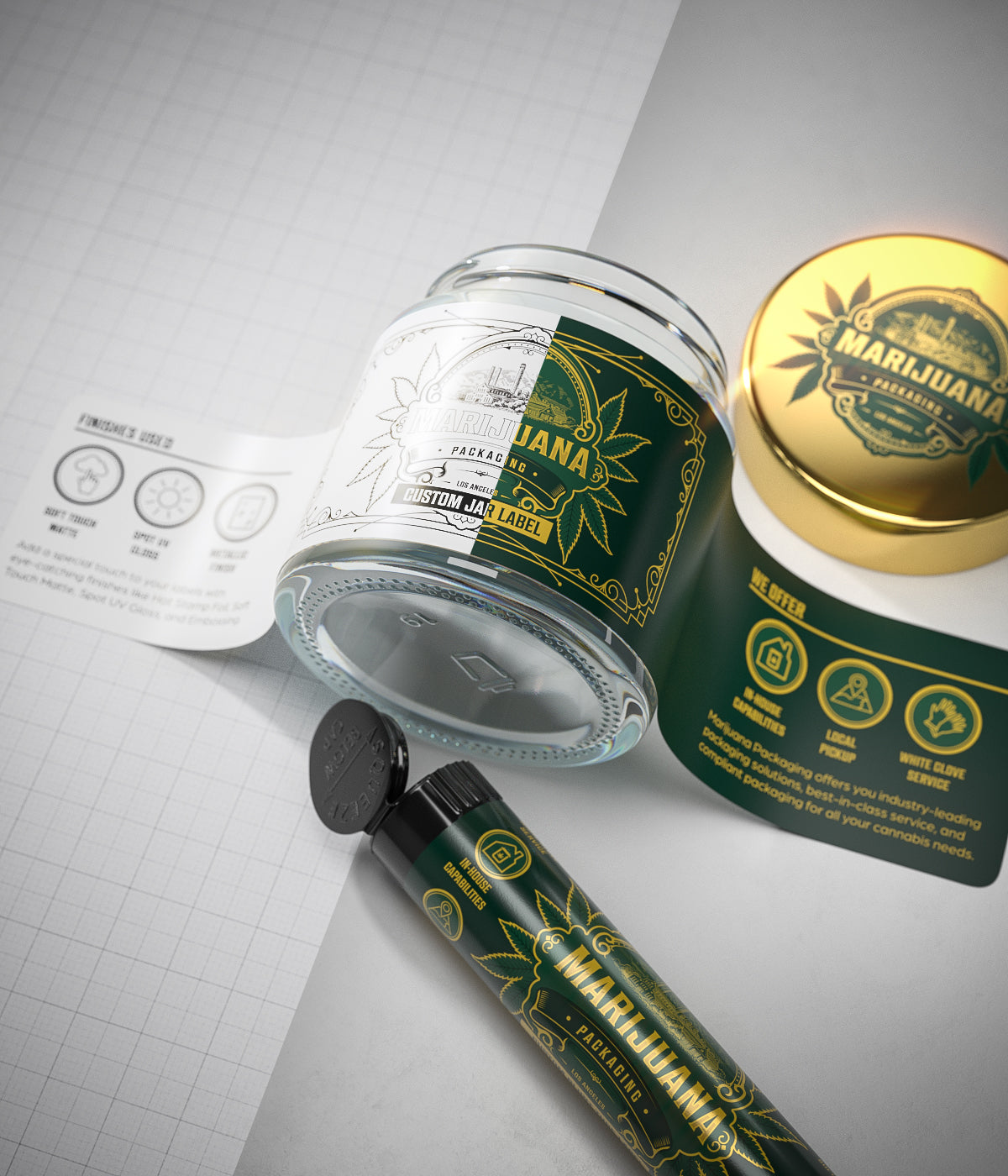
Delving deeper, the choice of specific colors in packaging speaks volumes about the product and the brand identity:
Orange and Yellow: These warm tones suggest energy, friendliness, and optimism, making products more appealing to youthful buyers.
Green: The palette of the natural world symbolizes vitality, peace, and commitment to the environment, resonating well with items that are organic and naturally sourced.
Blue: Recognized for its broad allure, blue inspires confidence, wisdom, and serenity, rendering it an adaptable option for various products.
Purple: A touch of purple signals luxury, sophistication, and indulgence, appealing to consumers looking for premium experiences.
Turquoise: This color brings to mind clarity, purity, and calmness, qualities cherished in health and cleaning products.
Strategic Considerations in Color Selection
Selecting the right color palette for packaging demands thoughtful consideration:
Know Your Audience
It’s fundamental to understand the demographic details and psychological insights of the target market. Different shades elicit varied emotional responses and feedback from people across age categories, cultural affiliations, and gender differences. Bright and intense colors, like red and orange, may be enticing to a vibrant, energetic group. On the other hand, soft hues such as pastel blue or green might be more appealing to an older, more composed audience. Marketing experts must conduct in-depth research into the tastes and perceptions of their target consumers to ensure the chosen colors align perfectly with the individuals they intend to reach.
Reflect Brand Identity
The color palette chosen for product packaging must be a visual echo of the brand’s identity. This means that the colors should align with the brand’s core values, ethos, and personality. For a brand that prides itself on sustainability and natural ingredients, shades of green can reinforce this message. Similarly, a luxury brand might lean towards black, gold, or deep purple to convey sophistication and exclusivity. The consistency of this visual language across packaging and branding strengthens brand recognition and loyalty.
Convey the Right Message
Colors communicate. The hues selected for packaging have the power to convey messages without words. For example, blue can communicate trust and reliability, making it a common choice for technology and healthcare products. In contrast, earth tones like brown and green can suggest organic or eco-friendly attributes, ideal for natural products. This strategic use of color psychology can enhance the product’s appeal by aligning with consumers’ values and expectations.
Bottom Line
Within the fiercely competitive realm of retail, deploying color strategically in packaging emerges as a crucial tactic for engaging consumers and fostering brand loyalty. Colors do more than just please the eye; they convey messages, evoke emotions, and sway decisions on a deeper, often subconscious level. Leveraging the intricate psychology of colors allows brands to create packaging that not only catches the eye amid a sea of products but also connects profoundly with consumers’ emotions and thoughts. As the landscape of consumer products continues to evolve, mastering and applying the principles of color psychology in packaging will persist as a vital ingredient in the global success of brands.


Leave a comment
All comments are moderated before being published.
This site is protected by reCAPTCHA and the Google Privacy Policy and Terms of Service apply.